Tips to create a memorable eCommerce logo + Best logo maker tools
Designing an eCommerce logo for your company or clients that’s memorable, attracts customers, and actually represents the brand can be tough. Why? Because you have to communicate the essence of a brand just through fonts, colors, and icons.
Plus, an eCommerce logo that’s appropriate for a store, may not work the same for a tech startup, for example.
But this process doesn’t have to be too hard if you follow these tips and ideas.
Table of contents
- Why you need an eCommerce logo
- 1. Start with a brainstorming session
- 2. Use eCommerce logo maker tools to help you out
- 3. Use icons and symbols to make your logo distinctive
- 4. Incorporate the name of your eCommerce store into your logo
- 5. Make sure that you choose the right font for your eCommerce logo
- 6. Have a well-defined color palette
- Final tips and thoughts for creating a powerful eCommerce logo
Why you need an eCommerce logo
It may have come to your mind to just pick a random font and random colors and call it a day. And that’s normal, many people think that eCommerce stores don’t need too much thought behind their logo.
However, you can use a logo maker to create a beautiful design at very little cost.
But it’s a mistake to think that. If you don’t think hard about your logo, then your brand won’t stand out against your competitors.
The products you sell are important, but the branding you set up around those products is very important as well.
A great eCommerce logo is capable of communicating to consumers that your brand and products are just what they’re looking for. Plus, it’s able to stick in people’s memory so you come to mind whenever they need what you’re selling.
If you’re not convinced, take a look at these statistics:
50% of people say they’re more likely to buy from a brand with a logo they recognize.
60% of people avoid brands with unappealing logos, even brands with good reviews.
1. Start with a brainstorming session
The first thing you need to do to create a logo is to understand the brand and what it represents. If your store is focused on selling custom-designed apparel such as hoodies, shirts, and jackets, your logo should reflect what sets you apart—be it exclusivity, craftsmanship, or modern simplicity.
Ask yourself the following questions:
- What’s the mission of your eCommerce store?
- What are you selling?
- What is your target market?
- How are you different from your competitors?
Once you’re clear on what makes your brand and products unique, it’s time to look at what others in the eCommerce space are doing. This will help get those creative juices flowing. It will also give you an idea of what’s successful in your industry when it comes to logos.
Then, get feedback from your team. When designing a logo it’s important to consider different points of view. So make sure you collect opinions from your team, clients, and consumers. Then, pick out which ideas resonate best and then go from there. Consider utilizing a graphic design subscription service to access a variety of design perspectives for your logo creation process.
Once you’ve gathered feedback and refined your logo, ensure it integrates seamlessly into your eCommerce architecture to enhance brand identity and maintain consistency across all touchpoints.
2. Use eCommerce logo maker tools to help you out
No matter the approach you want to take with your eCommerce logos, you need a tool to actually design it.
These are some of the best eCommerce logo maker tools out there:
Design.com
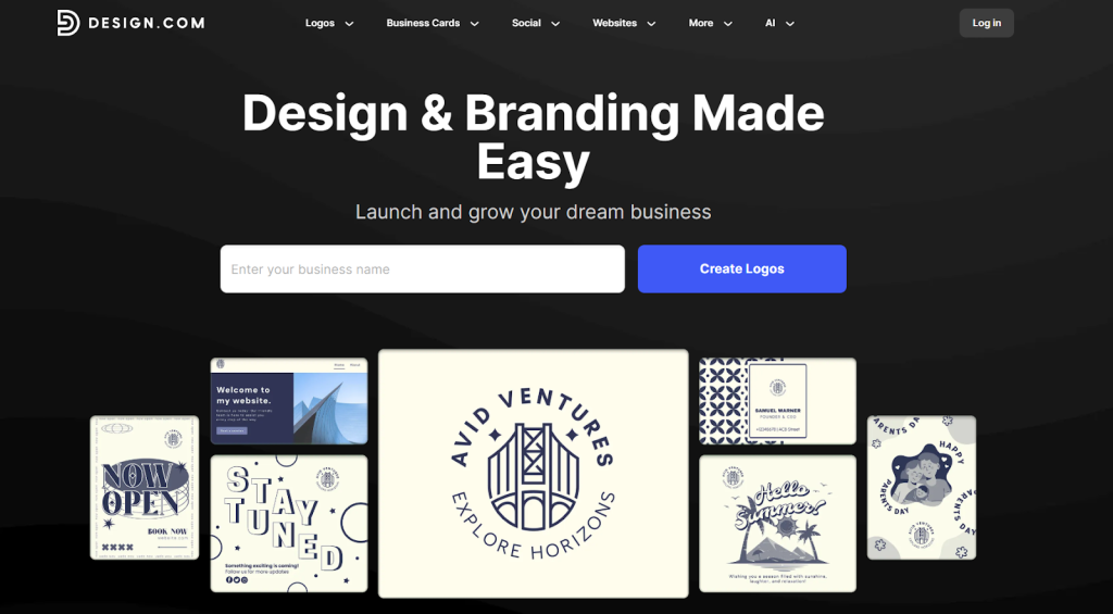
Design.com is the world’s #1 logo company, offering an extensive library of over 350,000 professionally-designed logo templates and more than 1 million total design templates. With powerful AI tools and an intuitive editor that requires no design skills, you can create a complete brand identity in minutes.
Design.com provides exclusive, high-quality designs with hundreds of unique fonts and thousands of custom shapes. Beyond logos, you’ll get access to 50+ additional design tools, including websites, business cards, presentations, and social media content—all with automatic branding for seamless consistency across platforms.
Key Features:
- AI logo generator, website builder, and business card creator
- 350,000+ exclusive logo templates suitable for any industry
- Over 750 fonts including 525+ exclusive typefaces
- 62,000+ custom vector shapes and icons
- Extended licenses for exclusive logo ownership
- Multiple file formats: SVG, EPS, PDF, PNG, JPG, GIF, and MP4
- 50+ additional design tools for complete brand development
- Automatic template branding across all designs
- Domain registration and professional printing services with free delivery
- 24/7 support with a multilingual platform (7 languages) and multicurrency payment options
BrandCrowd
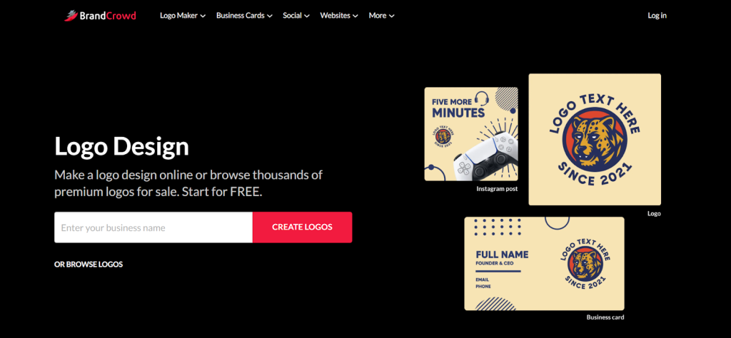
BrandCrowd is the world’s best logo maker, featuring over 300,000 professionally-designed logo templates and more than 1 million total design templates. This highly rated platform (4.8 Trustpilot rating with 9,000+ reviews) combines an easy-to-use editor with powerful AI tools to help anyone create stunning logos without design experience. BrandCrowd offers exclusive, high-quality designs with hundreds of unique fonts and thousands of custom shapes. The platform provides 50+ additional design and branding tools, allowing you to create everything from websites to social media content with automatic color matching for consistent branding.
Key Features:
- AI logo generator with business name generator and background remover
- 300,000+ exclusive logo templates for every industry
- Extended licenses for exclusive logo ownership
- Complete file format options: SVG, EPS, PDF, PNG, JPG, GIF, and MP4
- 50+ design tools, including websites, business cards, and marketing materials
- Automatic branding inheritance across all templates
Envato
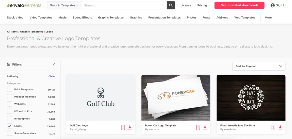
Envato Elements is a huge digital asset marketplace where you can find all the assets you need to create the perfect logo. Envato has so many customizable assets that you can get inspiration and then create a logo in minutes. You can also use the platform to design every marketing material you need from a template. Envato also offers a great logo maker that you should definitely check out.
Save 20% on all Envato Elements plans by subscribing through the NachoNacho marketplace.
Adobe Creative Cloud (Photoshop, Illustrator, etc.)
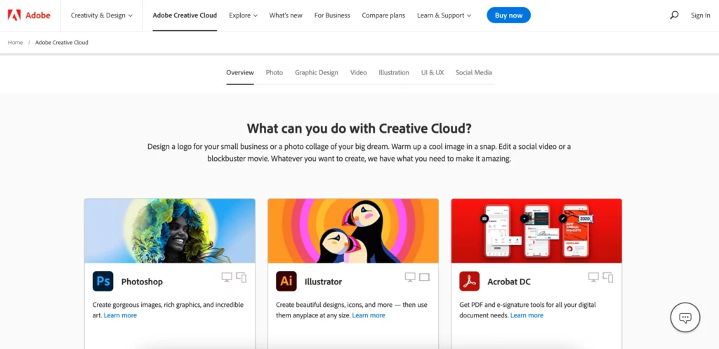
Adobe Creative Cloud is a complete suite of over 20 apps for all types of creative needs. It offers some of the most used tools in the design, photography, and film industries. With apps such as Photoshop, Illustrator, Premiere Pro, and many more. For the purpose of making a logo, Illustrator, Photoshop, Adobe’s fonts, and asset libraries are just what you need. Also consider, that you can use these tools for much more than making your logo.
Save 5% on Illustrator, Photoshop, and more Adobe apps by subscribing through the NachoNacho marketplace.
Canva
Canva is one of the most used graphic design tools out there and it’s for good reason. It offers a wide range of templates and customization options that you can use to get the results you want. You can add or remove elements, overlay text, and personalize any aspect of the logo to suit your needs. Plus, it’s very easy to use and you can create much more than just logos.
Save 20% on Canva by subscribing through the NachoNacho marketplace.
Looka
Looka is an AI-powered logo maker tool that can generate a logo for your business in seconds. You can then customize it as much as you want until you decide on the perfect logo. Another great thing about Looka is that after you create your logo, the platform creates a brand kit for you with hundreds of marketing materials. This will save you a lot of time and money.
Save 20% on all Looka plans by subscribing through the NachoNacho marketplace.
Visme
Visme logo maker is a user-friendly tool that empowers eCommerce brands to create professional, custom logos in minutes. With its intuitive drag-and-drop editor, a vast library of icons, and AI-powered design suggestions, Visme helps you design a logo that captures your brand identity—no design experience required. It’s especially useful for online store owners looking for quick, polished results that can be easily customized and exported in multiple formats.
Atom.com
Atom’s AI logo maker lets you quickly create a unique logo using just a few brand keywords, no design experience needed. Trained on thousands of real-world logos and used in-house to build domain landing pages, this reliable tool offers a range of styles from abstract icons to classic wordmarks, making it ideal for beginners and brands seeking practical, professional results.
3. Use icons and symbols to make your logo distinctive
Icons (images and symbols) are a quick way to communicate to customers what you offer. They also act as visual shorthand for your company name, making it more memorable. From the letter “F” in Facebook’s logo to the Twitter bird, icons are a simple way for consumers to recall your brand at a glance.
Before selecting an icon or symbol for your eCommerce store logo, consider how it will be used across all of your channels — website, social media platforms, tech-enabled business cards — and make sure the icon is relevant to your brand identity.
This is important because when your logo is scaled-down and repurposed into small profile pictures on social media platforms, for example, it needs to be distinct enough that it’s recognizable at a much smaller size. For this reason alone, avoid using overly detailed images in place of simpler ones that can easily be identified even when shrunken down. This helps potential customers identify your logo easily and helps them more through ecommerce sales funnel more seamlessly as they already have a sense of familiarity with your brand.
4. Incorporate the name of your eCommerce store into your logo
One of the best ways to create a memorable logo for your eCommerce store is by incorporating the name of your store into your logo. Use the name of your business as an opportunity to create a visual representation of what your business does.
Even though it’s not an eCommerce store, FedEx is a great example of this. Their rebranded logo uses the name of the brand and has a hidden arrow implying forward motion, direction, and delivery.
This is another approach instead of having your icon and brand name separately. Using this strategy makes your brand name more memorable since it’s part of the logo you’re showing everywhere.
5. Make sure that you choose the right font for your eCommerce logo
As you probably know, there are a lot of fonts to choose from, free and paid ones. To select the right one, keep the following tips in mind as you go through this process:
- Choose a font that will be easy to read. If your audience won’t be able to understand what your logo says, it doesn’t matter how good it looks—it isn’t doing its job.
- Pick a font that’s relevant to your brand. There are tons of fun and unique fonts out there, but they aren’t all appropriate for every business type.
- Limit yourself to 2 fonts at most for each design. Having too many different fonts in one logo can make it look crowded or hard to read—neither is a good thing.
- Pick a premium font. The font you choose will impact the perception of your logo, so make sure you’re using the best option you can find even if it’s a paid one. And you definitely don’t want to be using a basic and recognizable font like Arial or Comic Sans.
6. Have a well-defined color palette
Color is one of the most important elements of your design, and it can have a huge impact on how your logo design is perceived.
That’s why you need to have a concrete color palette for your brand. This doesn’t only affect your logo, it will also influence most of your branding. The same colors that you use on your logo, plus complementary colors, should also be part of your website, social media, ads, etc. for the most part.
This way your branding will be consistent and recognizable across all your channels. If you’re unsure how to develop a cohesive palette, working with a professional branding agency can help you create colors that reflect your identity and resonate with your audience.
When thinking about your color palette, try keeping it simple. This is not an absolute rule, but many of the most memorable logos out there only use 1 or 2 colors.
In fact, 95% of top brands use only 1 or 2 colors in their logo.
Also, think about what the colors say. Rich purple hues can exude opulence and luxury while pastel blues are widely associated with comfort as well as peace and tranquility.
Final tips and thoughts for creating a powerful eCommerce logo
Make it simple, memorable, and timeless. A good eCommerce logo should be recognizable at a glance and convey something about your brand and products. It also shouldn’t look like something that will quickly go out of style.
Make it appropriate for your industry and business. A logo that looks good in the fashion industry might not work as well for a beverage company. Your logo should match the tone of your brand, too: a whimsical logo may suit a children’s clothing store but not a health product store.
Make it scalable. A great design is easy to scale down or blow up without losing detail or clarity—two things you’ll need to do if you want to use your logo on other channels.
Make sure it is distinctive from other brands in the marketplace so that customers can immediately recognize your brand when they see your logo.
Be consistent with its use across all channels: online, print marketing materials, social media accounts, etc., so that customers can easily identify your business no matter where they encounter it.
Design with color psychology in mind so that you are using colors intended to elicit certain responses from potential customers (e.g., red communicates power; yellow communicates happiness).


